
Analysis and prediction of infectious diseases based on spatial visualization and machine learning

This experiment is carried out on a computer with Intel i7-10700 processor and 16 GB of running memory. The operating environment is 64-bit Windows 10 system, and the algorithm implementation tool are MATLAB and ArcGIS.
Spatial analysis results
The global Moran’s I index of COVID-19 cases in China from 2020 to 2022 was calculated by using the spatial autocorrelation analysis method in ArcGIS. The results are shown in Table 2; Fig. 5. The value of the global Moran’s Ig changed from negative to positive, and showed an increasing trend year by year, indicating that the spatial distribution of the epidemic in China has changed from spatial dispersion to spatial agglomeration, and the degree of spatial agglomeration is becoming stronger and stronger. According to data from 2020, there is a negative correlation in the spatial distribution of the epidemic in China, which means that the spread of the epidemic in neighboring areas where the epidemic is severe is not as fast as expected, but relatively slow and stable. This is because at the beginning of the epidemic outbreak, the government’s prevention and control measures effectively curbed the “spillover” of the epidemic. The global Moran’s Ig for 2021 and 2022 were greater than 0, indicating a certain positive correlation in the spatial distribution of COVID-19 cases in China. The epidemic situation in areas with severe outbreaks and their surrounding areas is also relatively severe. The p-value is often used to test whether the Moran’s I index is significant. In this study, the p-value corresponding to the spatial autocorrelation coefficient in 2022 was less than 0.05, rejecting the original hypothesis. This indicates that COVID-19 data exhibits significant spatial clustering in the study area.

Spatial distribution pattern of COVID-19 cases in China from 2020 to 2022.
From the results of global autocorrelation analysis, it can be seen that the spatial distribution of epidemic situation in China has shifted from discrete to clustered, and there is a trend of further strengthening. However, the global spatial autocorrelation is a description and analysis of the spatial autocorrelation degree of the epidemic distribution in the entire region, which cannot reflect the differences between the different regions affected by spatial autocorrelation. Based on this, in order to analyze the epidemic situation in various regions of China and deeply explore the spatial interactions and influencing relationships between different regions. We further analyzed the spatial clustering characteristics of the Chinese epidemic using Anselin local Moran I in ArcGIS. Table 3 presents the results of local autocorrelation analysis of COVID-19 incidence in China from 2020 to 2022.
In this study, three time sections of 2020, 2021, and 2022 were selected for local spatial autocorrelation analysis. At a certain level of significance, the newly confirmed cases of COVID-19 in each region was divided into four spatial clustering patterns: high-high, low-low, high-low and low-high. H-H refers to the existence of some high value regions, and the regions around these high value regions are all high value regions. L-L refers to the existence of some low value regions, and the regions around these low value regions are all low value regions. H-L and L-H are just the opposite, indicating that the regions around the high value regions are all low value regions, or the regions around the low value regions are all high value regions.
From the experimental results, it can be seen that only the epidemic in Hong Kong in 2020 belongs to the H-H cluster model. At this stage, the situation of the COVID-19 epidemic situation in this region is relatively severe, the confirmed disease rate is relatively high, and the difference between this region and adjacent regions is small. As an important shipping and trade center in the world, Hong Kong has a high population density and a small per capita housing area. In the early stages of the epidemic outbreak, Hong Kong faced enormous difficulties. The region of L-L cluster pattern experienced two fluctuations, and the regional scope decreased slightly. It moved from Xinjiang, Gansu and Qinghai to Xinjiang and Tibet in turn, and finally to Shanxi, Shaanxi, Ningxia and Sichuan, showing a spatial pattern extending from the north to the northwest and central China. The H-L dispersion area can indicate that the number of confirmed cases in this area is higher than that in the surrounding areas, and there have been a hot spot area of the epidemic. It mainly included Hubei in 2020, Shaanxi and Yunnan in 2021, and no region belongs to this model by 2022. From 2020 to 2022, the number of L-H regions decreased from 6 to 2, and the scope was greatly reduced, mainly distributed in East China and Central China.
Then, taking the provincial administrative region as the statistical unit, we analyzed the data of COVID-19 confirmed cases in China from 2020 to 2022 with the center of gravity trajectory migration algorithm, and obtained the center of gravity trajectory of China epidemic. The center of gravity, migration direction, migration angle, migration distance, stage attribute mean and attribute change intensity of COVID-19 confirmed cases in each period were calculated by using the formula in Sect. 3.4, as shown in Table 4. In addition, we also mapped the migration path of the center of gravity of COVID-19 epidemic in China, as shown in Fig. 6, which can clearly and intuitively reflect the temporal and spatial evolution characteristics of COVID-19 epidemic in China and the change process of attribute intensity.
From Table 4; Fig. 6, it can be seen that the temporal and spatial evolution of China’s COVID-19 in 2020–2022 has the following characteristics. The first stage was from 2020 to 2021, the center of gravity of COVID-19 epidemic slowly moved to the southeast, and it moved from the center of Hubei to the southeast of Hubei. The intensity of its attribute change was − 0.81, which was negative. Compared with 2020, the epidemic situation is decreasing. Wuhan, Hubei Province is the first outbreak place in China. At the beginning of the epidemic, due to the lack of knowledge and information, it was difficult to grasp the epidemic situation in time and take necessary prevention and control measures, which led to the spread of the virus. The second stage was from 2021 to 2022, and the focus of the epidemic moved from east to southeast in Hubei to southwest in Jiangxi. Its change intensity reached 31.82, showing an expanding trend of fluctuation, and the epidemic situation intensified. From the overall distribution of the center of gravity, it had undergone a large-scale migration, mainly distributed in the southeast of Hubei and the south of Jiangxi. The track of its movement was becoming faster and faster, and the intensity of attribute changes was changing from negative to positive. This indicated that the epidemic was expanding continuously, and the overall spatiotemporal pattern presented the characteristics of moving towards the southeast.

COVID-19 epidemic center and migration path in China from 2020 to 2022.
Data preprocessing
During the process of collecting COVID-19 raw data, there may be data loss and abnormal fluctuations. Not preprocessing can affect the integrity of the dataset and reduce prediction accuracy. In this study, we filled in or replaced missing values and outliers with the average of the corresponding time points before and after the problem point. In addition, normalization was performed on all datasets to limit the data to the range of [-1,1]. The purpose of normalization is to scale the range of values of different features to similar intervals, accelerating the convergence speed of the prediction model. Finally, we used the number of COVID-19 cases in the first seven days to predict the number of cases in the following day. Figure 7 illustrates how to extract and construct features for prediction from historical data.

Feature generation process.
Single model prediction results
In this section, we selected the daily newly confirmed cases in Guangdong Province from August 7, 2022 to December 20, 2022 as the data set for the prediction model. This study divided 136 sets of COVID-19 data into training and testing sets. The training set accounted for 80% of the total dataset, including 111 sets of data, while the testing set accounted for 20% of the total dataset, including 25 sets of data. In order to prove the rationality of the selection of base learners in the stacking integration model proposed in this study, we first analyzed the prediction performance and differences of each single model. On the COVID-19 dataset, experiments were designed to compare the prediction results of various base learners. All base learners ARIMA, ELM, WNN, SVR, RNN, and LSTM were trained and verified by three times day forward chaining cross-validation. The raw data were divided into the original training set D and the original test set T, then D was divided into four equal training sets \(D_1\), \(D_2\), \(D_3\) and \(D_4\). In the k-th cross-validation, \(D_k+1\) was the validation set, and \(\left\ D_1, \ldots ,D_k \right\\) was the training set. For the i-th learning algorithm, the verification set \(D_k+1\) in the k-th cross-validation can get the corresponding output \(D__k+1^i\) through this learner. At the same time, after each training, the test set T was put into the training model for prediction, and the average of the three predictions was obtained to form the data set \(T_i\). The above steps were repeated by different base learners. Finally, the prediction results \(\left\{ D_2^i,D__3^i,D__4^i,i=1, \ldots ,8 \right\}\) of verification set of several base learners were combined to form a new training set \(D’\) of the second layer meta-learner of the stacking model, and the prediction results \(\left\ T_1,T_2, \ldots ,T_i,i=1, \ldots ,8 \right\\) of test set of several base learners were combined to form a new test set \(T’\) of the second layer meta-learner of the stacking model. The second layer of meta learners was trained in new training sets and new test sets. We draw the prediction results of each base learner on the test set on the same graph, and used different colors to distinguish different models, as shown in Fig. 8.

The newly confirmed cases of COVID-19 in Guangdong Province from November 26th to December 20th, 2022 were compared with those predicted by various models.
In order to make the prediction effect more intuitive, we showed the comparison results of three prediction performance indicators of each model in the form of bar chart in Fig. 9. It can be seen that the SVR model has the lowest MAE and RMSE values, indicating that compared to other models, the predicted results of the SVR model are closer to the true values and can more accurately predict the propagation and development trend of COVID-19. This is mainly because compared with other models such as neural network, SVR can use fewer free parameters to adjust the model, which also makes it easier to adjust and optimize the model. At the same time, it has also been verified that SVR is indeed an excellent prediction model in the field of machine learning. On the contrary, the values of MAE and RMSE of time series ARIMA model were the highest, reached 0.679 and 0.854 respectively, indicating that its prediction performance is poor. The ARIMA model is based on regular time series for prediction. If the regularity of the time series changes, the predictive performance of ARIMA will be affected. However, there are obvious structural mutations and inflection points in the daily confirmed case dataset of Guangdong Province. For example, the values of the 85th and 102nd groups of data are three times higher than the previous group, which reduces the predictive performance of the ARIMA model.

Predictive performance metrics using the three times day forward-chaining cross-validation.
In addition, from some experimental results, it can be seen that RNN, SGDM-LSTM, Adam-LSTM, and RMSProp-LSTM machine learning models based on cyclic structure have better predictive performance than Wavelet models. And the predictive performance of the LSTM model is superior to RNN model, especially when using the RMSProp optimizer to train the LSTM network, all indicators of predictive performance are smaller. From this experimental result, we can conclude that the LSTM model has stronger ability in predicting epidemic trends than RNN. RNN usually only considers the current input and some previously processed historical inputs, and there are problems with gradient vanishing and gradient explosion. The LSTM network structure introduces gating mechanism, which can more accurately identify the basic patterns and trend behaviors in COVID-19 time series data. However, LSTM is inferior to RNN in training speed and interpretability. For the three optimizers, SGDM is the most common optimizer with almost no acceleration effect. RMSProp is an upgraded version of SGDM, which improves running speed by eliminating oscillations during gradient descent. Adam is an improved version of RMSProp. However, from the experimental results of this study, we can see that the performance of Adam seems to be worse than RMSProp, so it is not that the more advanced the optimizer, the better the results.
Stacking model prediction results
The stacking integrated model needs to integrate diverse prediction algorithms to facilitate a more comprehensive observation of the dataset from different perspectives of data space and data structure. In order to get a better integration effect, we not only analyzed the individual prediction performance of each base learner, but also considered the correlation between base learners. Finally, by comprehensively comparing the prediction effects of each model, we chose the “good but different” algorithm as the first-level base learner of the stacking model. We first made individual predictions on the base learner, comprehensively compared the prediction errors of individual models, and then measured their correlation by calculating the pearson correlation coefficient of the prediction errors between different models. The specific operation can be achieved using the corrMatPlot calculation function provided in the matlab library. The error correlations of each model algorithm are shown in Fig. 10.
The correlation between the prediction errors of the base learners we used is very high, which shows that each model has learned the effective features in the data set during the training process. Among them, SGDM-LSTM, Adam-LSTM, and RMSProp-LSTM have the highest error correlation. This is because three models are all based on LSTM network structure and only optimized using different optimizers. Although the optimization principles are different, the observation methods of the data are generally similar to a large extent. The ARIMA model and other network models have similar prediction results, and can extract information such as trends, seasonality, and residuals from time series data. And the predictive performance of the ARIMA model is poor, so we do not consider using the ARIMA model for fusion. However, the observation mode and principle of SVR are quite different from other algorithms, so the correlation of its prediction error is relatively low. In order to find the best combination of base learners, we used five combination methods to dynamically model based on different base learners: Model I (RMSProp-LSTM, SVR, ELM, RNN, Wavelet), Model II (RMSProp-LSTM, SVR, ELM, Wavelet), Model III (RMSProp-LSTM, SVR, ELM, RNN), Model IV (ELM, Wavelet, SVR), and Model V (RMSProp-LSTM, ELM, SVR). The second layer of meta learners not only needs to correct the deviation of the algorithm, but also needs to maintain a high generalization ability to prevent overfitting. Therefore, we chose a simpler RBF algorithm and used PSO algorithm to optimize it to improve its prediction performance.

Correlation plot of base learner prediction error.
After completing the training of each base learner, we used the generated new dataset to train the meta learner and output the final results. In order to more intuitively represent the prediction performance of the stacking integrated model, the real values were compared with the prediction results of five stacking models. Figure 11 shows the prediction results of the stacking model on the test set.
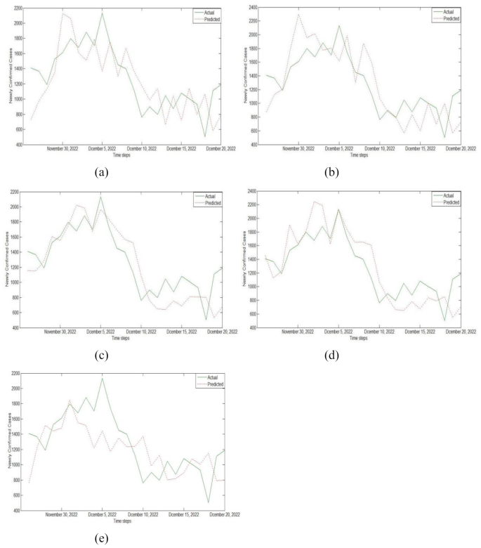
Prediction results of training on test data sets using (a) Model I, (b) Model II, (c) Model III, (d) Model IV, and (e) Model V.
The error evaluation indicators of single model and stacking integrated model are shown in Table 5. By analyzing Fig. 11; Table 5, we can conclude that among all single prediction models, the error evaluation indicators of SVR and RMSProp-LSTM were smaller, indicating better prediction performance. Among all prediction models based on stacking integration, the MAE, RMSE, and MAPE values of Model III were 0.135, 0.162, and 0.204, respectively, with the smallest error index and the best prediction effect. This indicates that the base learners composed of RMSProp-LSTM, SVR, ELM, and RNN models can maximize the prediction accuracy of stacking model fusion. In addition, the MAE values of the five stacking integrated models based on different base learners proposed by us were all around 0.15, the RMSE values were all around 0.18, and the MAPE values were all around 0.23. Compared to all single prediction models, they have better prediction performance. For example, the values of MAE, RMSE, and MAPE in Model I were 0.185, 0.221, and 0.269, respectively. Among the five stacking models, the three error indicators of Model I were all the highest, indicating the worst prediction performance. However, compared to the excellent SVR and RMSProp-LSTM, their prediction effect is more excellent.
In order to quantify the difference in prediction performance between the stacking integrated prediction model and the base learner, as shown in Table 6, we calculated the improvement rates of three evaluation indicators \(I_index\). The calculation of improvement rate can help us further understand the prediction accuracy and practical value of integrated models, providing reference for model optimization and improvement. Table 6 records the improvement in prediction performance of the stacking integrated prediction model compared to single prediction models. The results showed that the algorithm set with the lowest prediction accuracy was Model I: RMSProp-LSTM, SVR, ELM, RNN and Wavelet, and the algorithm set with the highest prediction accuracy was Model III: RMSProp-LSTM, SVR, ELM and RNN. For example, for Model III, compared to ARIMA, ELM, SVR, Wavelet, RNN, SGDM-LSTM, Adam-LSTM, and RMSProp-LSTM, the MAE index decreased by 80.12%, 71.99%, 48.28%, 56.45%, 70.65%, 65.65%, 66.25%, and 58.72%, respectively. The RMSE index decreased by 81.03%, 81.03%, 45.27%, 61.06%, 71.58%, 59.70%, 63.27%, and 60.20%, respectively, while the MAPE index decreased by 34.62%, 34.62%, 37.80%, 40.18%, 40.00%, 36.45%, 35.85%, and 30.85%, respectively. In addition, in all integrated experiments, the maximum decreases in the evaluation indicators MAE, RMSE, and MAPE of the stacking integrated prediction model were 80.12%, 81.03%, and 40.18%.
From the above experimental results, it can be seen that using different prediction models can lead to different prediction results. ARIMA prediction model is very flexible, but its prediction accuracy is low for unstable or abrupt trend data sets. ELM is fast in learning and can solve problems quickly and efficiently, but its regularization parameters and the number of hidden neurons are difficult to determine, so we need to constantly adjust the parameters in the experiment. In this experiment, SVR has achieved better prediction accuracy. Compared with other regression algorithms, SVR can perform well even when the training dataset is small, making it possible to train the model in situations of data shortage. Wavelet can predict nonlinear and non-stationary time series data more accurately than traditional prediction algorithms such as ARIMA. Compared with other neural network models, RNN have a slower training speed and require multiple iterations to obtain more accurate prediction results. This is because RNN needs to consider all previous information when processing sequence data, and therefore needs to repeatedly calculate and update parameters to achieve the optimal state of the model. The LSTM model has higher prediction accuracy and better generalization ability, but requires more time and resources for training. In general, compared with the above prediction model, the stacking integrated model can use a variety of algorithms to observe the COVID-19 dataset from different perspectives, which makes the prediction dimension of the integrated model more comprehensive. To some extent, it overcomes the limitations of individual learners and can effectively combine the characteristics and advantages of various learners to improve prediction accuracy and stability.
In order to verify the effectiveness of the model in this paper, we collected two groups of data, including the monthly incidence of AIDS in Anhui Province from January 2005 to December 2018 and the monthly incidence of tuberculosis in Shanxi Province from January 2005 to December 2017, and then applied the above stacking framework to establish the prediction model. Figure 12 shows the historical incidence data of AID and PTB. The number of AIDS cases is on the rise, while the number of tuberculosis cases is on the decline, and there is a certain periodicity. Before 2012, the number of new cases of AIDS per month was relatively small, and the fluctuation was relatively small. However, since 2012, the number of new cases of AIDS per month has increased rapidly and the fluctuation has become more obvious, while the incidence trend of tuberculosis is the opposite.

The monthly incidence trend of (a) AIDS and (b) PTB over the years.
On two sets of target datasets (AIDS and PTB), the data can be processed similarly to the previous COVID-19 data, divided into a training/validation set and a testing set, and trained through six base learners. The output results of four sub models, including RMSProp-LSTM, SVR, ELM, and RNN, were used as inputs to the stacking model to construct the training and testing sets of RBF. It can be seen from Table 7 that the stacking prediction model’s three evaluation indicators on two datasets are still smaller than a single prediction model, and its prediction performance is still optimal.
link


![Average Cost of Medical School [2025]: Yearly + Total Costs](https://educationdata.org/wp-content/uploads/2025/09/page-1.png "Average Cost of Medical School [2025]: Yearly + Total Costs")